|
|
|
Another youngster who has evidenced a willingness to sublimate his ego to the necessity of the story, Farmer has synthesized the strengths of many of the outstanding inkers of the 70's (McLeod, Rubenstein, Green) to create a clear, clean, warm style which invites the reader's eye to stay and linger. He is a welcome relief from the overwrought, line-happy "Image" offspring who often tax the brain and confuse storytelling with picture-making.
SEE: Incredible Hulk with Dale Keown; Avengers (current series) with Alan Davis;
and Superboy's Legion!
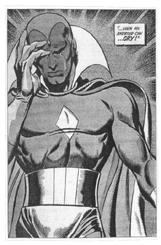
LEFT:
Beautiful, clear brush strokes from Mark Farmer compliment Alan Davis'
precision pencils. From X-Men #87
|
|
|
|
|
A standout in any era, relative youngster Palmiotti has developed a beautiful synthesis with his frequent partner, Joe Quesada. Each derives something from their collaboration which is not there independently. Palmiotti is precise and sharp, but without sacrificing warmth or intrigue within the pictures. He has a fantastic facility for shadows and how objects look when they occupy those shadowed spaces. Often simple forms and geometric shapes within the darkness will reveal themselves to be more that they appear, with Palmiotti's talent tricking the eye into seeing what he wants it to.
SEE: Daredevil (current series) #1 - 5 ; Legends of the Dark Knight #140 -145 with Paul Gulacy
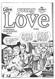
LEFT:
Our only beef is that the hands at the bottom of the page blend together,
but otherwise this is a super piece by Jimmy and his partner in crime, Joe Quesada.
|
|
| |
|
|
A mainstay at Marvel for many years, Adkins is a perfect example of a man who had good skills as a penciller, but was far superior as an inker. He began with Marvel in the 60's after an apprenticeship with Wally Wood. Mavel put him to work drawing Dr. Strange, where Adkins' own uncertainty caused him to rely heavily on swipes and reference. He was replaced eventually, and moved on to the less demanding role of inker. For the next 20 years he brightened many Marvel books with his sharp, cultured lines.
SEE: Captain Marvel (first Marvel series) #18-19
LEFT:
Great work by Dan Adkins over the late Gil Kane. Adkins accentuated
Gil's greatest asset: POWER!
|
|
|
|
|
Most likened to Murphy Anderson, George Klein may have had an even more mannered and precise style. Klein, like Anderson (and to a lesser extent, Joe Sinnott) would create wonderful rounded shadows by dropping a well-weighted line and then creating a series of beautifully tapered feathers coming off of it, conforming to the contour of the object he was delineating. It gave those objects VOLUME, and always let you subconsciously know the size, shape and form of what you were looking at. Many modern inkers miss this elementary style of "investing" two-dimensional objects with the appearance of three dimensions. Often, their lines will be in direct opposition to forms they are supposed to define, or will throw shadows in a way which is counterintuitive to how we see them. Most of them would do well to study George Klein and simplify, simplify, simplify.
SEE: Avengers #59 - 63, with John Buscema
LEFT:
Perfectly controlled feathering highlights George Klein's work. Note how
the tapered lines always follow the contour of the form they define. From Avengers #58.
|
|
|
|
| |
Joe Simon spent almost 20 years as half of one of comics most celebrated creative teams, the powerhouse of Simon and Kirby. During the 40's and beyond, Simon, with his creative dervish/partner Jack Kirby, succeeded in turning the industry upside down again and again. Captain America, The Red Skull, Sandman and Sandy, Manhunter, the Boy Commandos, romance comics, crime comics, kid gangs; they did it all! The chores were split on their innumerable creations: Simon usually writing and occasionally laying out out the stories, Kirby pencilling, and Simon more often than not providing inks and finishes. As to his style, Simon's own description says it all: he likened his inking to "hay", because of the long, thick, sometimes haphazard and overlapping brush strokes he applied to figures, backgrounds and shadows. The one thing Joe did NOT do very well was delineate textures! The comics, however, were always readable, fun, and uniquely Simon and Kirby!
SEE: Yeesh! Hard to pin down EXACTLY since many Simon and Kirby jobs involved an inker round table, but most any S & K job has at least SOME great Simon inks!
LEFT:
A nice example of the unmistakeable Simon and Kirby style from 1950.
Note the Joe Simon "hay" covering every surface.
|
|